Why do women live longer than men?
Women tend to live longer than men. In 2021, this difference amounted to a 5-year gap in global life expectancy: the average life expectancy was 73.8 years for women versus 68.4 years for men.
What causes these differences? Is it because women outlive men at old ages? Or because young men are more likely to experience accidents and violent deaths?
In this article, we’ll look into the sex gap in life expectancy: how it arises, how it varies around the world and how it has shifted over generations.
The sex gap in life expectancy is not a constant
Women tend to outlive men around the world.
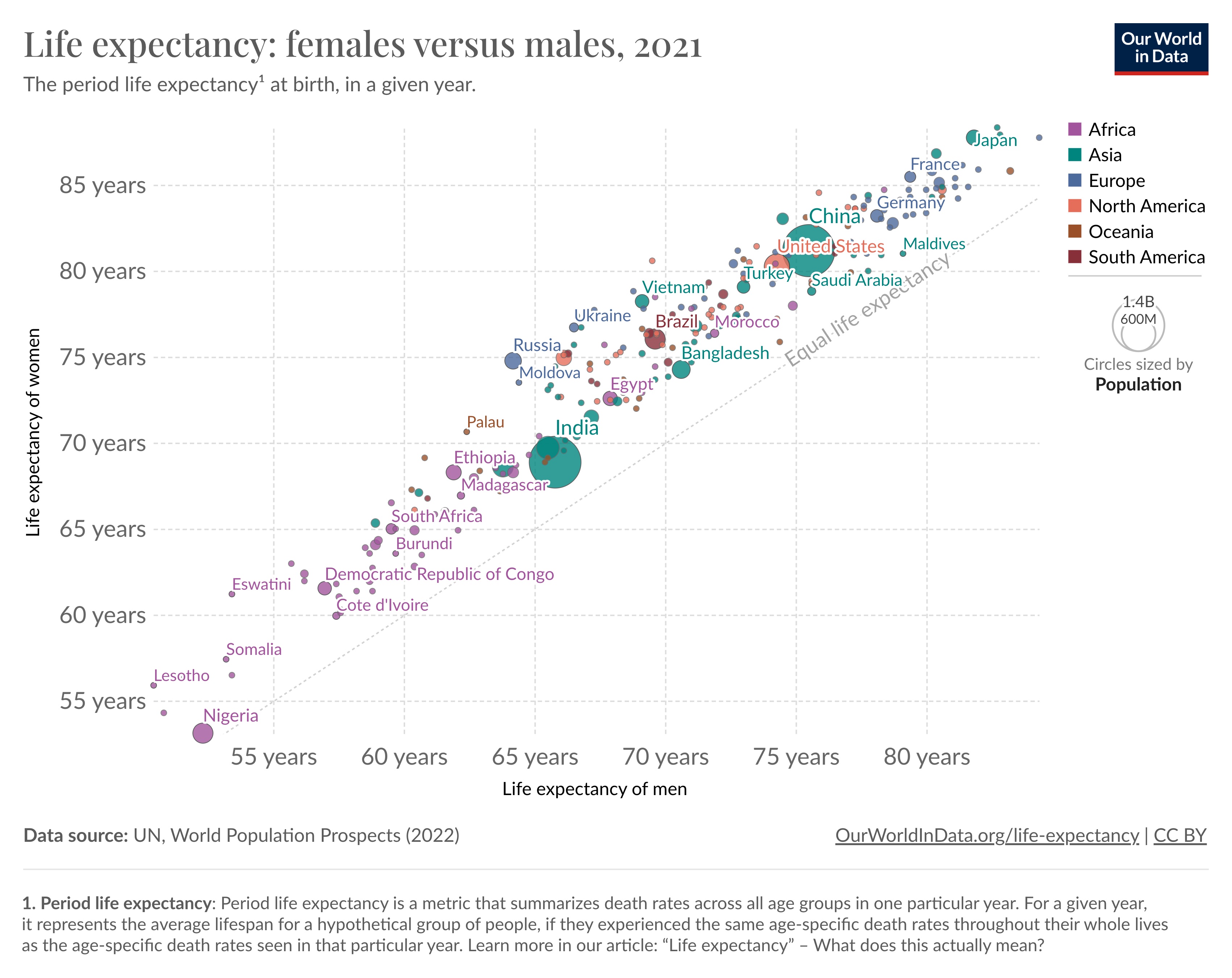
You can see the difference from the chart below. It compares female and male life expectancy across countries. Male life expectancy is shown on the horizontal axis and female life expectancy on the vertical axis.
All countries lie above the diagonal line, meaning female life expectancy is higher.
But the chart also shows that the gap varies between countries: some are much further from the line than others.
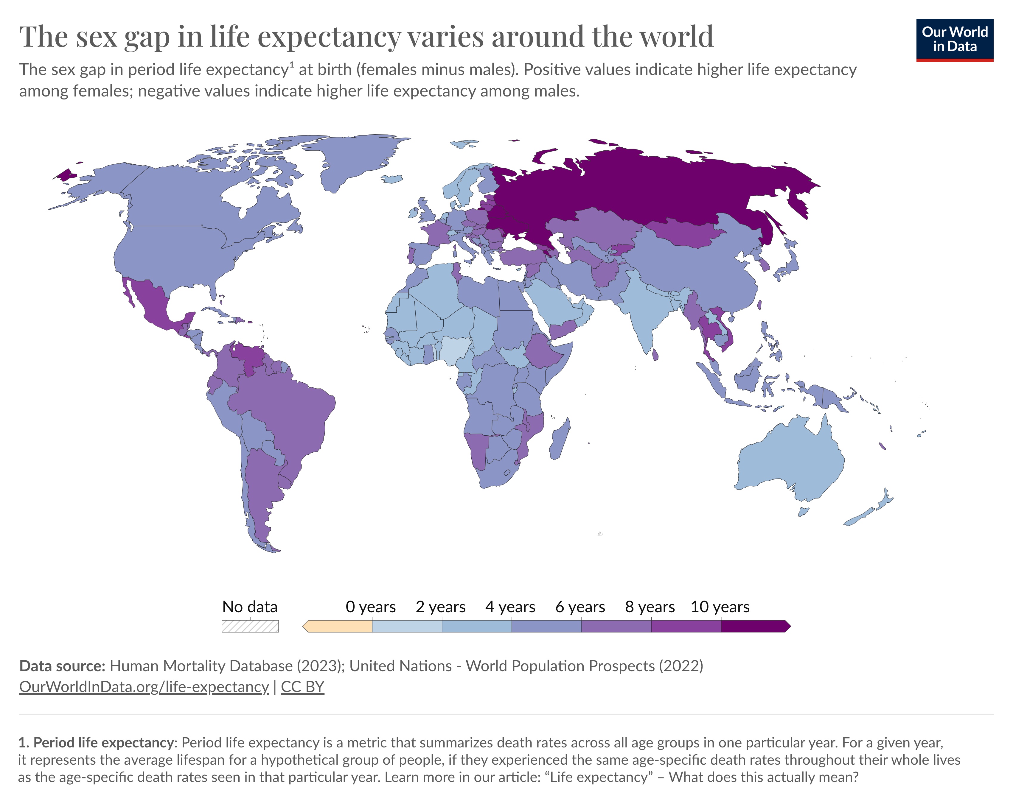
We can also see this in the map below. In some countries, like Russia, Belarus, and Ukraine, the gap is large – more than 10 years in 2021.
In other countries, such as Nigeria, it is less than 2 years.1
The next chart shows how the sex gap has changed over time.
Large spikes are visible during major wars, reflecting the fact that many young men died then.
You can also see that the gap gradually widened in many countries over the twentieth century, but has narrowed again in recent decades.
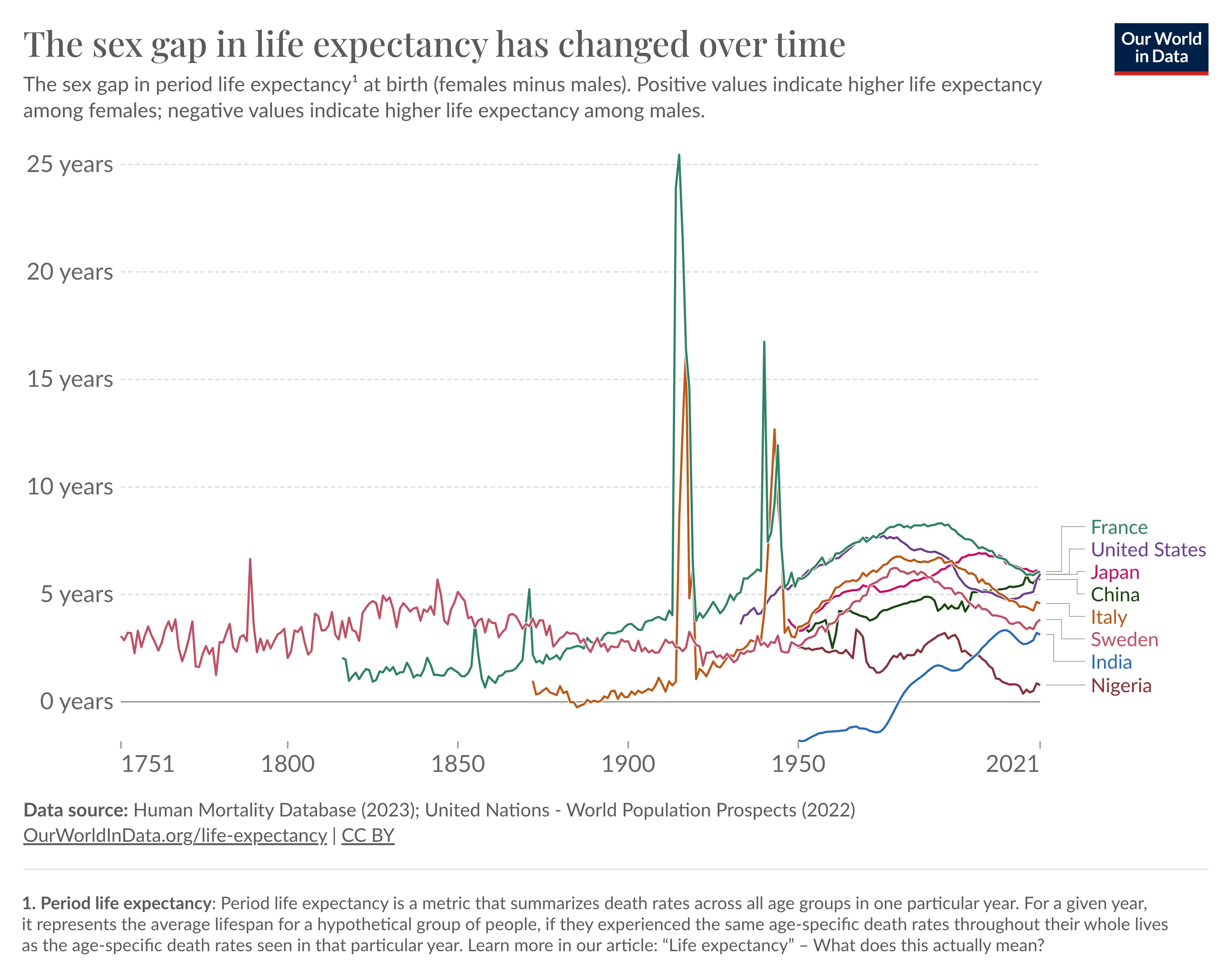
These charts show that the sex gap in life expectancy is not a constant. It varies between countries and has changed over time.
But why does this happen? And where does this gap come from?
A refresher on period life expectancy and what it means
Before we dive into the reasons for the sex gap in life expectancy, let’s consider how life expectancy is measured.
In this article, the data refers to the period life expectancy. This is a metric that summarizes death rates across all age groups in one particular year.
For a given year, it represents the average lifespan for a hypothetical group of people, if they experienced the same age-specific death rates throughout their whole lives as the age-specific death rates seen in that particular year.
This means it is directly influenced by factors that affect death rates, such as changes in living standards, public health and medicine, behaviors, and events like wars and pandemics.
Additionally, the data in the article refers to the average difference in life expectancy – of course, a share of men live longer than women, across countries.
The sex gap in life expectancy comes from gaps in death rates across age groups
The sex gap in life expectancy comes from sex differences in death rates across age groups – infants, youth, and older people.
Let’s look through them one at a time.
Infant death rates tend to be higher among boys than girls
The sex gap in life expectancy begins at birth, as newborn boys have a higher probability of death than newborn girls.
Boys are more likely to be born premature;2 and they also have higher death rates in the first week of life.3 This gap continues throughout infancy.
You can see this in the chart, where infant death rates in girls are shown on the horizontal axis, and death rates in boys are shown on the vertical axis.
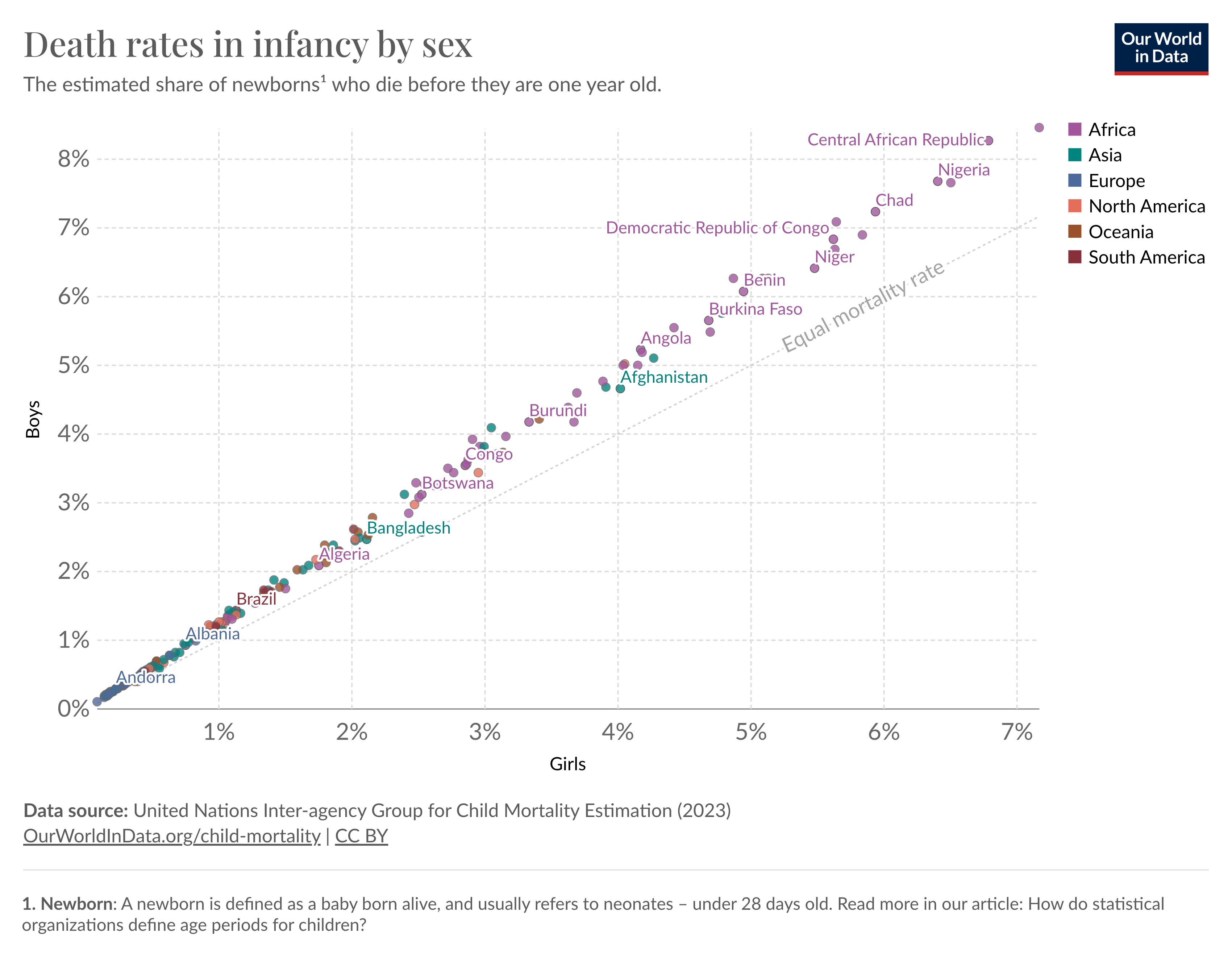
In 2021, all countries are above the diagonal line, which shows that infant death rates were higher in boys.4
The sex gap in infant death rates is due to a range of factors.5
One key reason is that boys tend to be more vulnerable to infectious diseases, which may be due to a less developed immune system.6 Another is that boys are more susceptible to some genetic disorders due to having only one X chromosome.7
Youth death rates tend to be higher among men than women
After childhood, death rates rise due to accidents, violence, suicides, poisonings, and other ‘external causes of death’.8
These causes of death tend to be more common among men than women – which widens the sex gap in life expectancy.
The chart shows the gap in overall death rates at age 25, as an example – the gap in death rates is also seen at other ages.
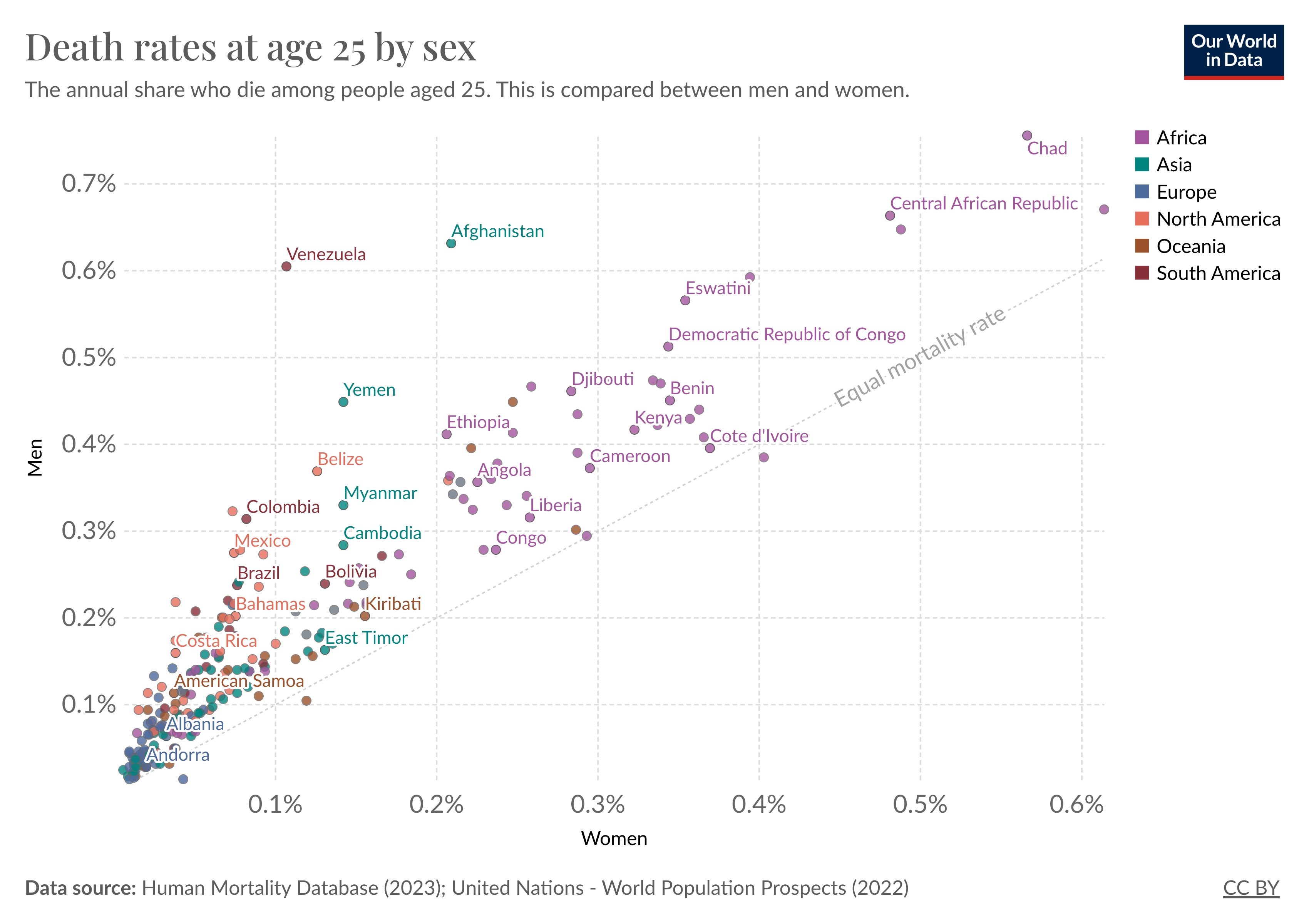
As before, most countries are found above the diagonal line, which means death rates are higher among men.
Older age death rates tend to be higher among men than women
The sex gap in life expectancy is also sustained at older ages.
As people grow older, death rates rise steeply from a range of causes, including respiratory and cardiovascular diseases, infections, cancers, and autoimmune diseases. Men tend to have higher prevalence rates and death rates from these conditions, which further contributes to the gap in life expectancy.9
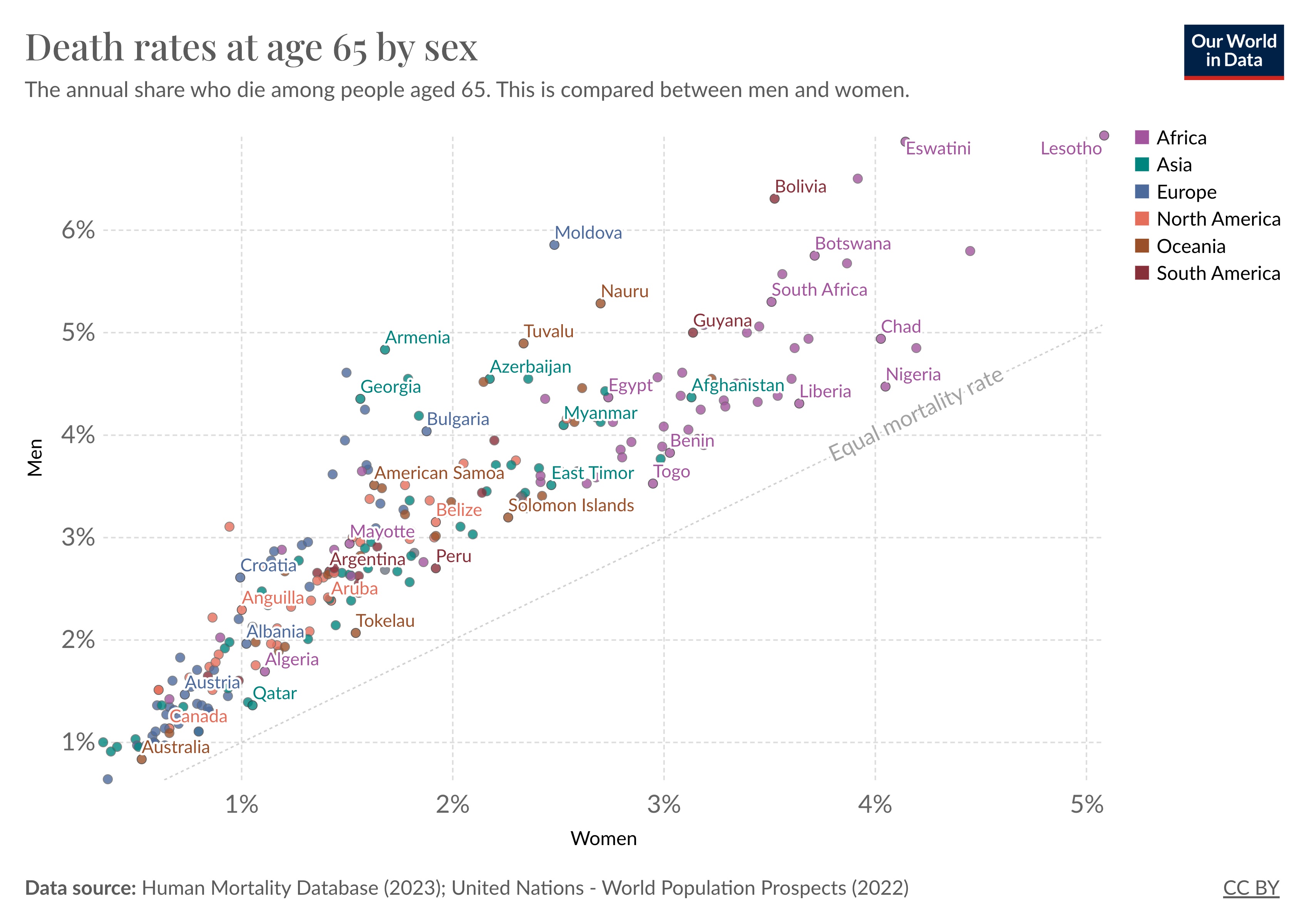
These differences are partly due to gender differences in health behaviors, such as smoking, alcohol, and drug use, and occupational risks which tend to be more common in men and have growing consequences with age.10
As before, in 2021, all countries are above the diagonal line, which means death rates are higher in men than women.
The reasons for the sex gap in life expectancy have shifted over time
So far, we’ve seen that the death rate in males is higher among infants, young people, and older people.
But how much do these differences contribute to the overall gap in life expectancy? And how has this changed over time?
In a recent study by Virginia Zarulli et al. in 202111, the authors show how different age groups contribute to the gap.
This is shown in the chart below for France, which has long-term mortality data.
The total sex gap in life expectancy is shown as the total height of the curve. The stacked areas show how the gap arises from sex differences in death rates in each age group.
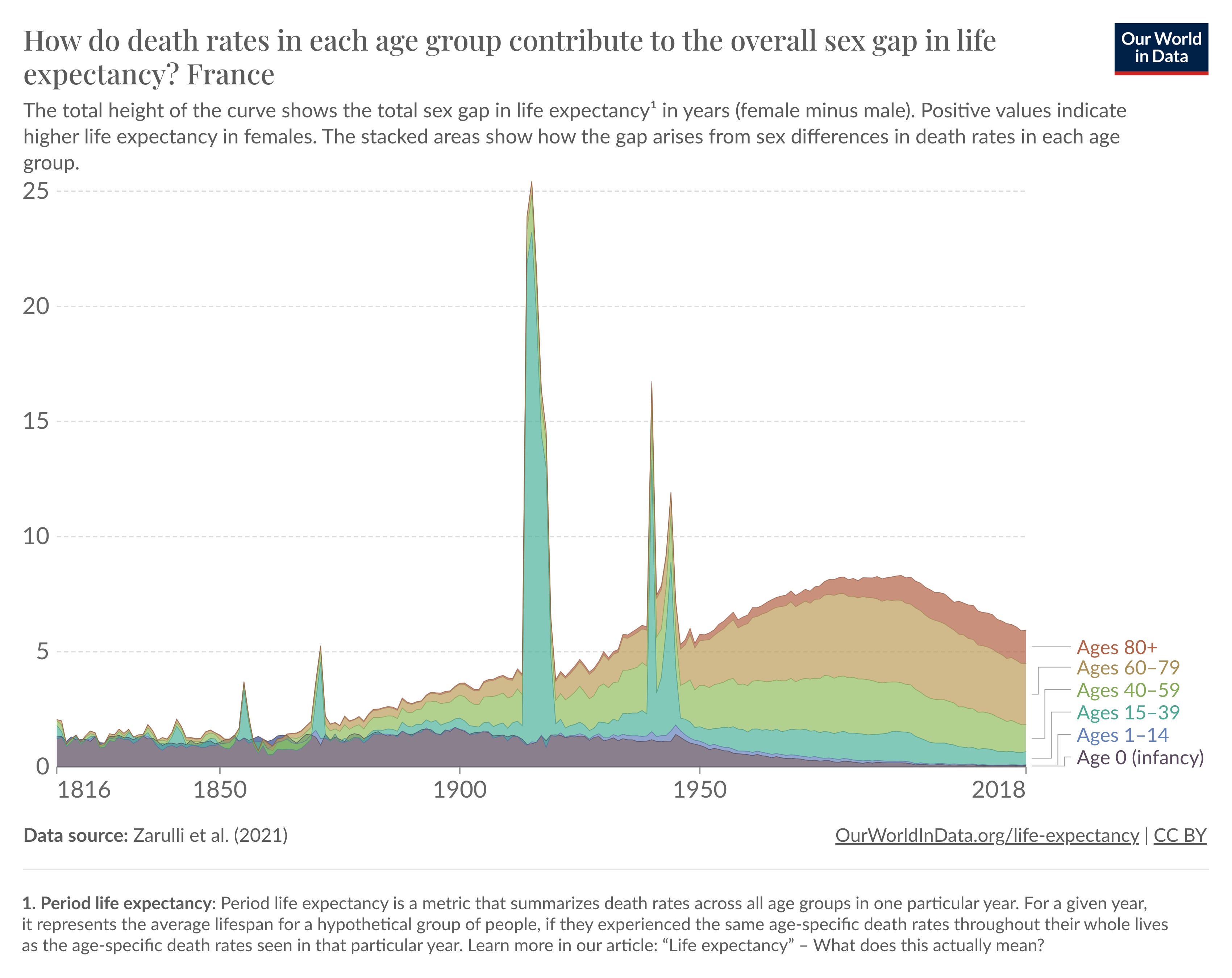
You can see that both the overall sex gap in life expectancy and its composition have changed over time.
Before 1900, half of the gap was due to sex differences in mortality among infants.
During the World Wars, the gap spiked due to a surge in death rates in young men.
But, over the twentieth century, the gap also widened gradually. As the chart shows, this came from sex differences in mortality in youth and older ages specifically.
Research suggests that the rise in smoking – which was especially prevalent among men – was a significant contributor to this widening gap.12 As smoking has fallen, the gap has narrowed.
You can see that the sources of the gap have shifted over time: most of the gap now comes from middle and older age death rates, with infant and child death rates making only a small contribution.
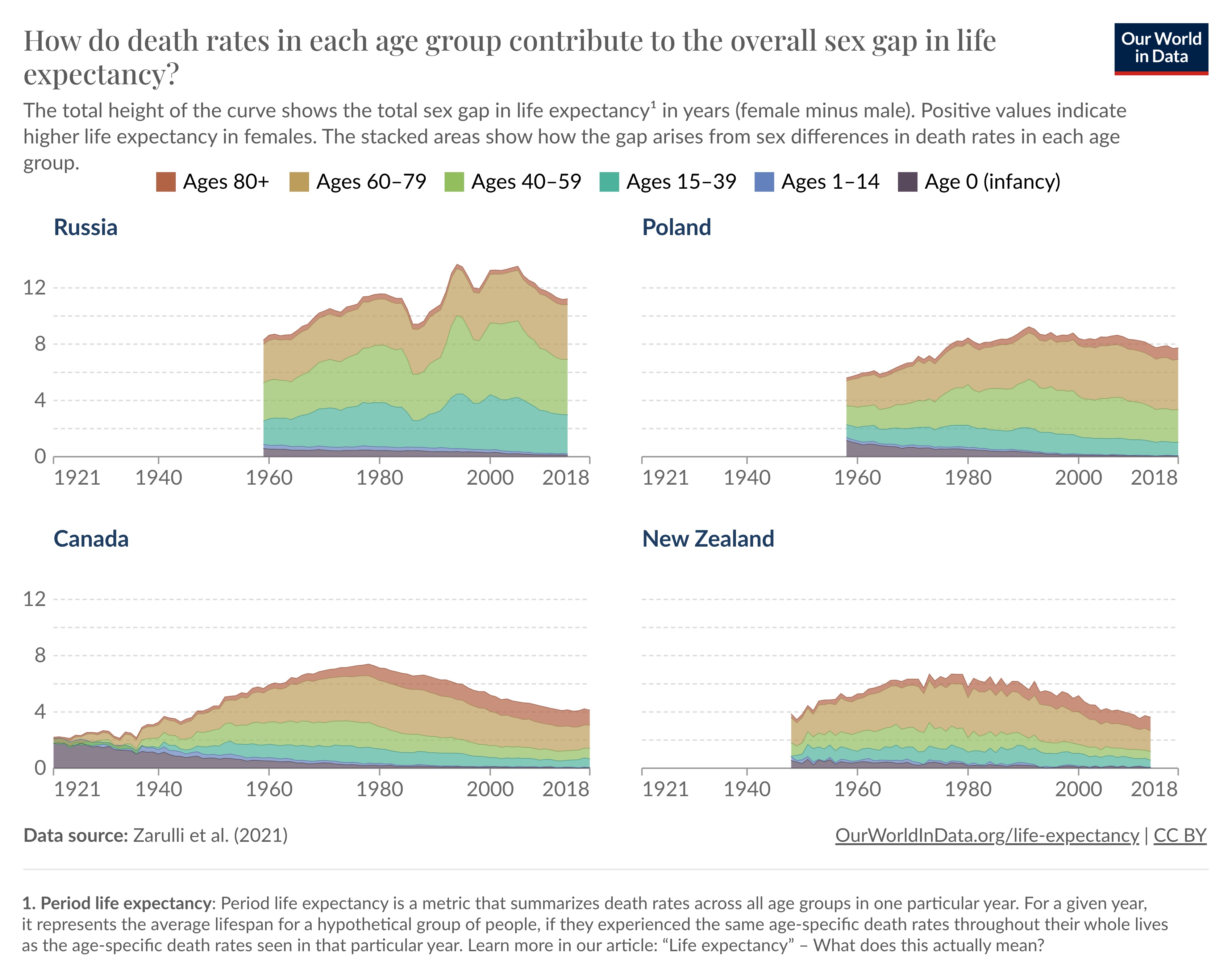
The chart below shows that there are also differences between countries. In Russia and Poland, for example, the overall sex gap in life expectancy is still large, due to higher death rates in young and middle aged men than women.
Conclusion
The sex gap in life expectancy begins at birth: newborn boys have higher death rates than newborn girls, as they’re more vulnerable to diseases and genetic disorders.
It continues in youth, when boys have a higher death rate than girls, typically due to violence and accidents.
It’s sustained at older ages when men have higher death rates than women from chronic health conditions, which are partly due to higher rates of smoking, alcohol, and drug use.
As there are many reasons for the sex gap in life expectancy, its size varies between countries and has shifted over time.
In the past, gender differences in infant mortality were the leading cause of the gap in life expectancy. But now, differences at older ages are a larger contributor to the gap in life expectancy.
Republished with permission of Our World In Data under a Creative Commons license. Read the original article.


